


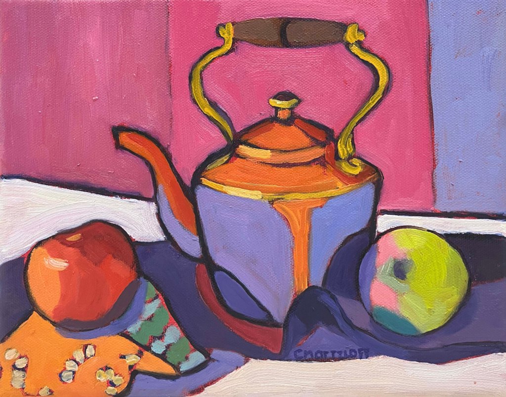
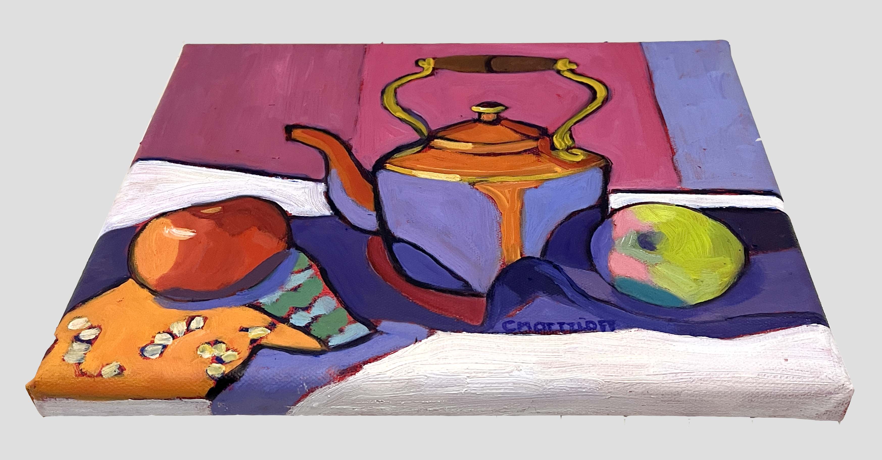
Steeped in Color – 8″ x 10″ Oil on canvas $375
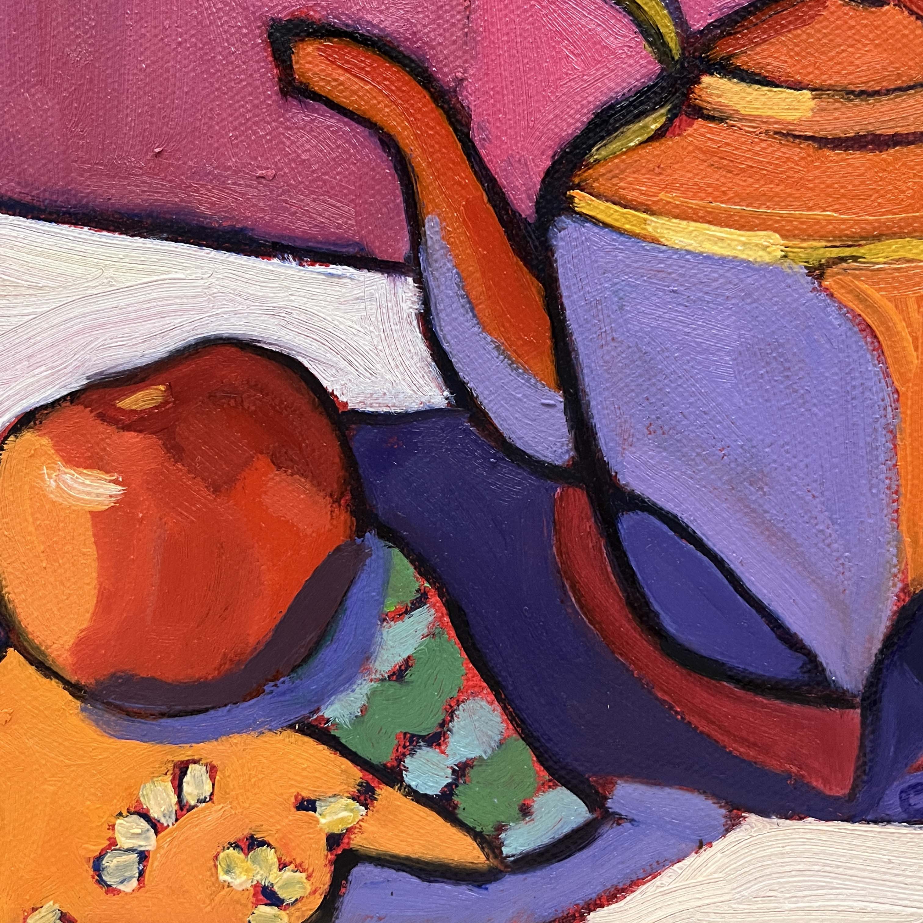
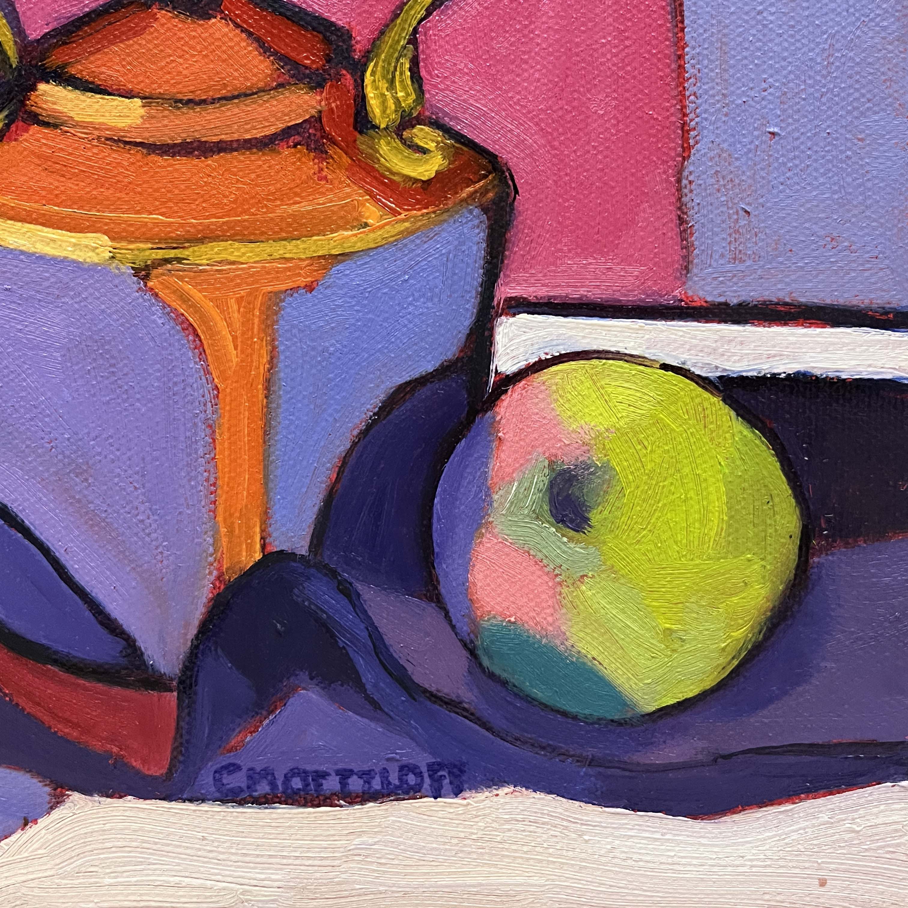
Steeped in Color is another exploration of the deep, saturated hues that first captivated me in Velvet and Copper. This composition revisits the same vintage kettle, but with a fresh perspective—leaning even further into bold, expressive color and contrast. The interplay of warm copper tones against cool lavenders and vibrant pinks creates an almost electric energy, making the everyday feel extraordinary.
There’s something undeniably romantic about these rich, velvety colors. They remind me of warmth, of candlelit evenings, and of the way deep hues can evoke both nostalgia and vibrancy. In this piece, I allowed the color relationships to lead the way, embracing the unexpected harmonies that emerged. It’s a reminder that familiar subjects can always offer something new, especially when viewed through the ever-changing lens of color and emotion.
About this Painting:
This painting is currently on view as part of my solo show “Held Together” at the Nassau Club in Princeton, where it joins a collection of works that celebrate color, light, and the beauty of everyday objects. If you have the chance to visit, I’d love for you to experience these paintings in person!
To learn more about Steeped in Color, including details on the piece, please reach out to me here Contact Me.


Styling Tips for “Steeped in Color“
A Pop of Color in A Neutral Space – The bold hues in this painting would stand out beautifully against a white, cream, or soft gray wall, adding warmth and vibrancy to a minimalist or modern space.
Pair with other Bold Artworks – For those who love color, this piece would work well in a gallery wall alongside other saturated, expressive paintings or vintage-inspired prints.
Compliment with Jewel-Toned Accents – Deep sapphire blues, warm ochres, or rich magentas in textiles (like a throw pillow or a vase) could pull out the depth of color in this piece and create a cohesive, artful space.
Categories: Original oil paintings, Still Life
